Systemised IVAs
Elevating Interactive Visual Aids (IVAs) for Enhanced User Engagement. Defining the next evolution of IVAs, that drives engagement, fostering adoption, and amplifying overall user satisfaction.
Biogen
2022-2023
UX & Design Direction
Tablet APP
Company:
Date:
Role:
Format:

The Background
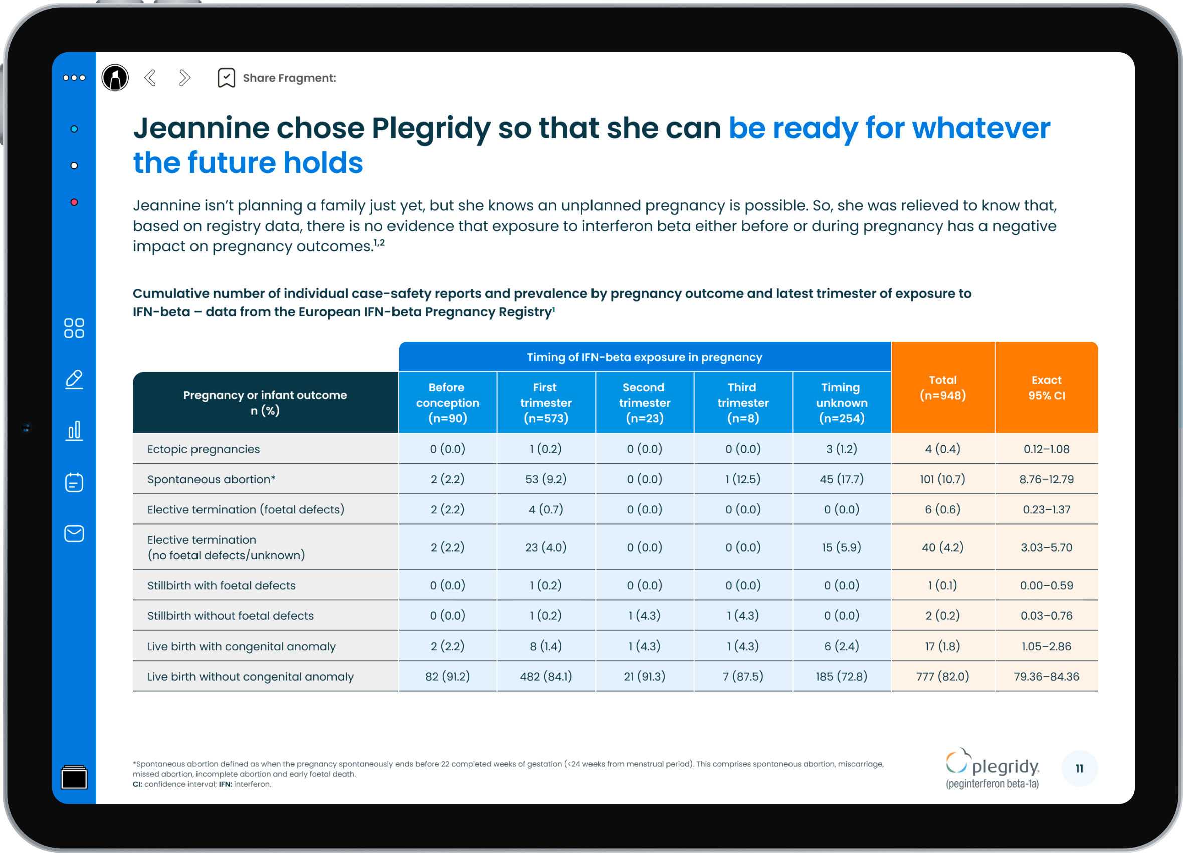
Interactive Visual Aids (IVAs) present medical information in an engaging and visual manner using dedicated Tablet Applications. In the pharmaceutical industry, sales representatives use IVAs during interactions with healthcare professionals to better explain drug mechanisms, benefits, dosages, and side effects. IVAs can help to convey the product's value proposition more effectively and increase the adoption of the product.
Situation
Each IVA was designed and developed by external agencies, resulting in inconsistency in their formatting and underutilization of features. The existing IVAs were overly lengthy, and since they were custom-made, each one had to be created from scratch.
Complication
Since each IVA was custom-designed, the development process was lengthy and expensive. More critically, adoption rates were low because the IVAs failed to meet the field team's needs and expectations. The team struggled to utilize the assets effectively, and Healthcare Professionals (HCPs) encountered an inconsistent user experience.
Resolution
This initiative was design-led and meticulously tailored to the Field Team's requirements, integrating their needs into every phase of the process. To address the challenges, a unified global team was assembled to design, build, and oversee IVAs
The introduction of the new design system significantly accelerated the creation process, thereby reducing development time and cost. Furthermore, the newly established processes and governance mechanisms ensured enhanced consistency across the board.
The Results
• 60% Cost reduction of IVA Development
• 3x quicker production time.
• The new systemised IVAs carry consistent branding.
• Usage of IVAs increased by 300% following the update.
My Role
As the UX Director, I was responsible for
Setting priorities and timelines
Allocating resources
Gathering data and insights from users
providing creative direction
guiding the design process
developing guidelines
overseeing the implementation of designs
managing stakeholder relationships.
The Process
Phase 1: Exploration & Planning
Initiating our project with a focused 'UX Discovery' we aimed to formulate preliminary insights into the anticipated challenges and opportunities. We employed both quantitative & qualitative research methods; we identified patterns and developed our hypothesis through surveys and interviews of 30 users from the global field team. A striking 85% expressed a preference for shorter IVAs, cleaner visuals, and enhanced navigation.
A striking 85% expressed a preference for shorter IVAs, cleaner visuals, and enhanced navigation.
Key takeaways emphasized the importance of maintaining the existing format and structure to prevent low adoption and mitigate a protracted development process.
The clear necessity to prioritize field teams as end-users necessitated tailoring the UX closely to their needs and expectations.
Utilizing 5-second user testing, we pinpointed navigational patterns to facilitate swift, easy chapter access even during meetings in motion.
We mapped comprehensive User Journeys, encapsulating Preparation, In Call, and After Call phases.
Notable was the difficulty in post-call follow-up and conversation-driving; thus, we developed Share features to mark chapters of interest during calls, resulting in emails with 50% higher open rates and 80% higher click-through rates than alternative emails, driving engagement, and connecting doctors with BiogenLinc.
Integrating UX Discovery into the project significantly enhanced our ability to identify key problems and opportunities, which were subsequently transformed into specific requirements. Establishing a robust relationship early between stakeholders and the project team ensured alignment, built trust, and fostered an environment conducive to creativity.
Phase 2: UI Design & Systemisation
We defined a well structured, simplified visual language encouraging less content per page, making things easier to digest, with clear key messages.
We defined a 'medical' look and feel but it is neutral enough to carry individual sub-brands with enough flexibility for varied content types.
Clear / white-space encouraged
Tinted containers are used to help group content
One font is used throughout for simplicity/consistency
Colour deployed in a systematic way, ensuring brand recognition
Streamline icon library in brand colours used throughout to ensure consistency
To help establish a clear typographic hierarchy and to guide users through the presentation, all IVA’s now use the same font, ‘Poppins’ which helps to keep consistency and limit complexity.
There are a variety of different font sizes and weights that can be used to help differentiate headings, subheadings, and body text.

The use of colour has been systemised to enable consistency of application across all IVA’s. The brand-specific colours can be adjusted depending on the individual brand guidelines.
In general, palettes follow the colours stated in the relevant brand guidelines
Extra tints and accent colours can be added
Colour combinations were checked for accessibility before being applied
Infographics
Graphs and charts are used heavily within the IVAs to condense large amounts of information into easy-to-understand formats that clearly and effectively communicate essential points.
We defined a Bespoke infographics template to make the creation of infographics easy and consistent so it is easy to visualise otherwise dry content.
To aid visual consistency, we used a customised version of the Streamline icon library for all our iconography, adopted to each brand.

A new Navigation system
One of the needs the field team wanted is a clean and easy-to-use navigation. We defined a unified navigation bar that is easy to recognise making storytelling easier during consultations, with a consistent placement of elements and the use of easily recognisable iconography.
The consistent colour theming of the Nav bar ensures clear brand recognition on every slide.

We have introduced a "Chapter Slide," which immediately follows the cover slide. This feature enables users to seamlessly navigate to any section within the presentation by providing a quick overview of all content.
Furthermore, the "Sitemap" enhances user navigation throughout the IVAs. It provides a comprehensive view of all the slides included. It can be opened from the nav bar, thereby facilitating the ability to effortlessly jump to any desired slide from anywhere within the presentation.
Validating the Visual Language Through User Testing
After establishing a coherent visual language and exploring various slide and content types, we transitioned into a crucial phase of assembling and validating our concepts into a prototype, and test it.
We conducted a user study involving six participants from the field team to further understand user preferences and needs.
Participants expressed a desire for a more visual interface and a reduction in visible text. In response, we introduced ‘Overlays’—a feature designed to contain secondary information, seamlessly accessible with a single tap on any slide.
This approach not only enhances the visual appeal but also ensures that critical information is readily available without cluttering the primary view.

Another challenge the field team was facing, was how to engage following a call/meeting. In response, we devised and implemented the "Share" functionality.
The "Share" functionality enables field team members to select pages and share them through pre-approved emails post-call. Subsequently, these emails connect to the Global BiogenLinc portal, providing HCPs with an opportunity to delve deeper into the topic.


Phase 3: Efficiency Through Systematization: Establishing The Design System
Recognizing the pivotal role of consistency and efficiency in creating immersive Interactive Visual Aids (IVAs), we embraced the fundamental principle: the implementation of a singular, well-defined Design System.
Our Design System: Enabling Precision and Cohesion. This systematic approach ensures:
Consistency Across Products: Guaranteeing a unified and coherent user interface and experience across all elements.
Time-Efficient Design and Development: Significantly reducing build time and accelerating the design process.
Cost-Effective Solutions: Minimizing design and development expenditures by avoiding the repetition of efforts.
Enhanced Efficiency: Enabling the creation of more, within the same time frame, without compromising quality.
Unified User Experience: Ensuring all users interact with a cohesive and user-friendly interface.
Agile Development Support: Facilitating an adaptable and rapid development environment.
Minimized Rework: Diminishing the necessity for manual adjustments and overhauls.
Ease of Updates and Maintenance: Allowing for straightforward modifications and upkeep.


Comprehensive Guidelines for a Straightforward and Collaborative IVA Creation.
We’ve established detailed guidelines to streamline the Interactive Visual Aids (IVA) creation process for all parties involved - from requestors and the field team to content editors and stakeholders.
These guidelines touch on every relevant aspect of the IVA creation process, ensuring a clear understanding of limitations, specifications, and best practices complemented by examples.


Facilitating Seamless Requests with a Tailored Brief Template
To simplify and guide the content submission process for new IVAs, a distinct brief template has been crafted. This tool aids requestors in providing all necessary information and content, ensuring both precision and consistency in every new IVA creation.
Phase 4: The Final Milestone: Advocating for the New IVA System
Our journey culminated in a challenging, endeavour: championing the new, systemized Interactive Visual Aids across our organization.
Engaging various stakeholders, we aimed to not only share but also to illuminate the benefits offered by adopting the new IVAs.
Our mission was clear: to convey the value and ensure comprehensive adoption of the systemized IVAs, securing a unified and enhanced user experience across all platforms.
The Results
• 60% Cost reduction of IVA Development
• 3x quicker production time.
• The new systemised IVAs carry consistent branding.
• Usage of IVAs increased by 300% following the update.


Next case study
